Discount Car & Truck Rental
Digital Experience
Client:
Discount Car & Truck Rentals
Role:
Lead UX Designer
Team of 3 Designers and
1 Digital Analyst
Duration:
3 Months
The Problem
Discount Car & Truck Rentals approached us to assist them with a strategy that would address their business goals around increasing the number of bookings through their website. They needed both an analytics and design strategy to have a clear view of their customer’s behaviours and the conversion rates for completing a booking reservation. Discount wanted to get a full picture around user fallout in the reservation flow to identify areas of opportunities to improve and redesign their digital experience.
The goal was to conduct research and provide initial recommendations that would guide the product strategy to help them increase their revenue.
Challenges:
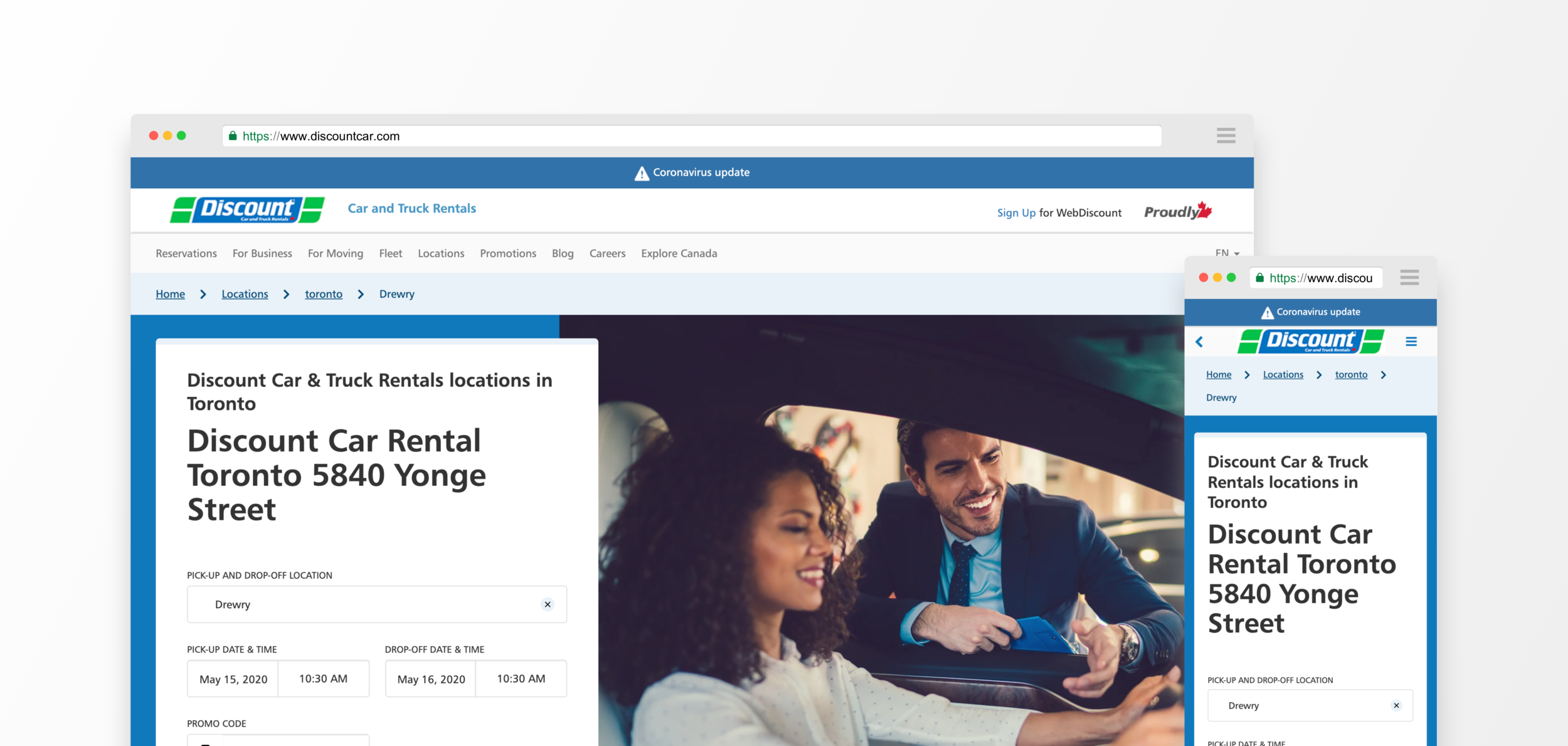
Existing mobile and desktop experiences were designed separately
The visual design language of their website is vastly different across the site
Only 4 weeks were allotted to conduct and synthesize user research
Lack of an existing customer panel to gain insights from
Working with data first
The investigation around conversion rates was driven by data collected through Google analytics and Amplitude to track events and the consumer funnel. I worked with our Digital Analyst to identify where most of the site traffic was coming from, and which entry points had the highest conversion rates. Because the home page had the highest impressions but lowest conversion rate, we looked into specific events on the page to understand where drop-offs were occurring.
Creating a Hypothesis
We noticed that only 11% of users who started a search proceeded to the booking funnel. Our assumption was that users weren’t finding what they needed on the home page to continue the reservation process. Our initial hypothesis was that there were usability issues on the reservation form on the home page that hindered users from continuing into the reservation funnel.
Conducting Usability Tests
I worked with the client to identify their target users to help me understand the criteria I needed to create a screener to recruit participants for our usability tests. Since the client did not have a panel, we used Respondent.io to recruit and schedule participants.
Target users
- Individuals who are moving and require a moving truck
- Individuals who require a car for a leisure trip
- Individuals who require a car for errands
Testing Protocol
We invited participants to do in-person moderated testing on both mobile and desktop experiences, totalling 10 usability sessions in 2 weeks. The objective of the study focused on the usability of each entry point on Discount’s website to find out if there were any critical issues that prevented users from entering the reservation funnel.
Scenarios:
- Booking a car for a vacation
- Booking a van/truck for a move
- Booking a car for a last minute interview
- Booking a large vehicle for on the job tasks
Metrics:
- Successful Task Completion
- Critical & non-critical errors
- Satisfaction rating
Usability Test Results
Observations
Our initial hypothesis that there are usability issues that are preventing users from getting into the reservation funnel did not seem to be true since most of our participants were able to complete a reservation when going through the home page funnel. Average completion rate for mobile was 90%, and 73.4% for desktop. Based on the after session questionnaire, the experience of the website had a generally positive experience, explaining that it was simple and easy to use. Based on the overall rating participants said they were satisfied or very satisfied. Even though there is some difficulty in a few scenarios, it didn’t completely block someone who was determined to make a booking reservation.
Hotjar Implementation
To continue the investigation around the initial hypothesis, we wanted to understand how users were actually interacting with their live site so we implemented Hotjar to capture screen recordings. We gathered over 2000 recordings and noticed that 71% of users were able to get into the reservation funnel from the home page. After reviewing the screen recordings and synthesizing the usability report results, there were key findings that we believed to be hindering conversions within the reservation funnel.
Top Pain Points
Lack of branch information
Participants wanted more information about branch locations to help them make better informed decisions for pick-up and drop-off points. It was difficult for users to understand which branches were nearby, especially on the mobile experience where the map was not a default view. Users expressed a need to see information such as distance of a branch, the hours of operation, and branches that serve after hours drop-offs. Based on Hotjar videos, users were constantly moving back and forth in the booking funnel to review branch locations.
Frustration around lack of vehicle and branch recommendations
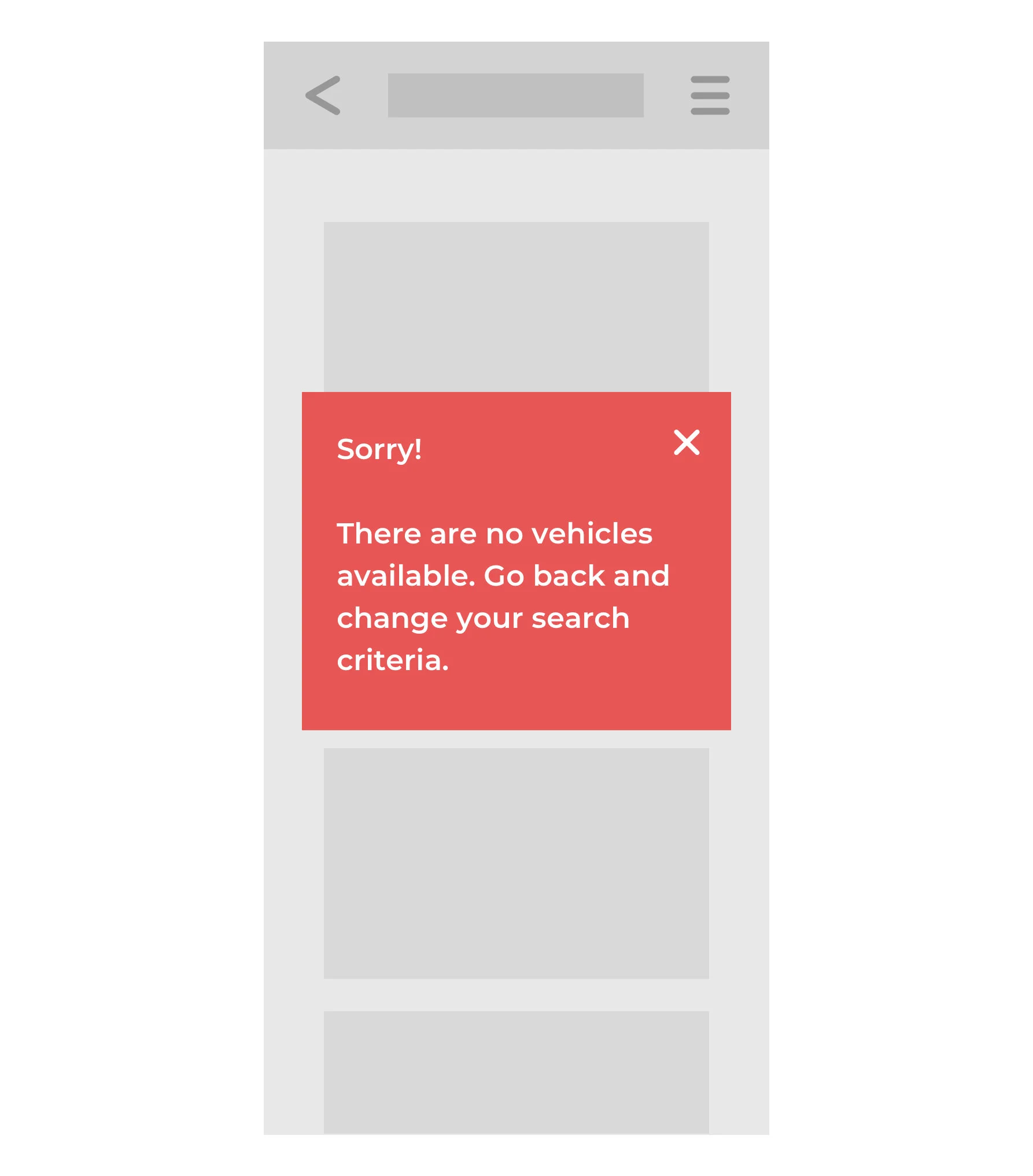
Users were struggling when they found out their branch of choice did not have availability for vehicles or if the branch was closed on their selected dates. Participants expressed that they would like recommendations when the vehicle that they’re looking for is unavailable. Their only way of checking availability was picking dates and times based on trial and error so they wanted to know what the next closest branch was that had vehicle availability. Many users expressed that they would go to a different company after attempting to find a location and vehicle 2-3 times.
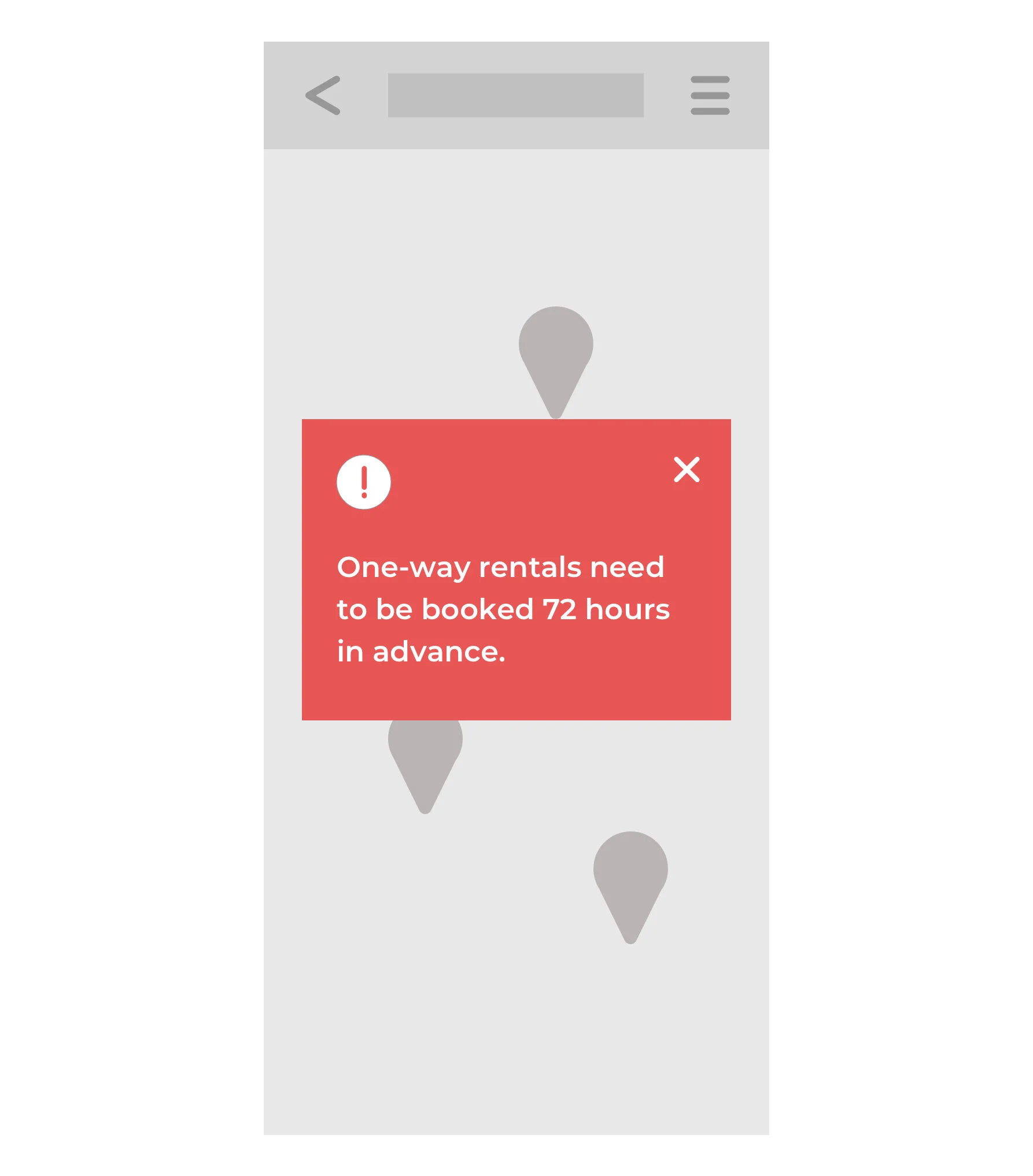
Frustration with operation bounces
There were specific business restrictions that prevented users from completing their bookings. The restrictions were presented in the form of pop-ups and created dead-ends for users. Examples of restrictions included: a 72 hour advance notice to book a one-way rental, and a minimum duration for a car rental.
User Flow Diagram
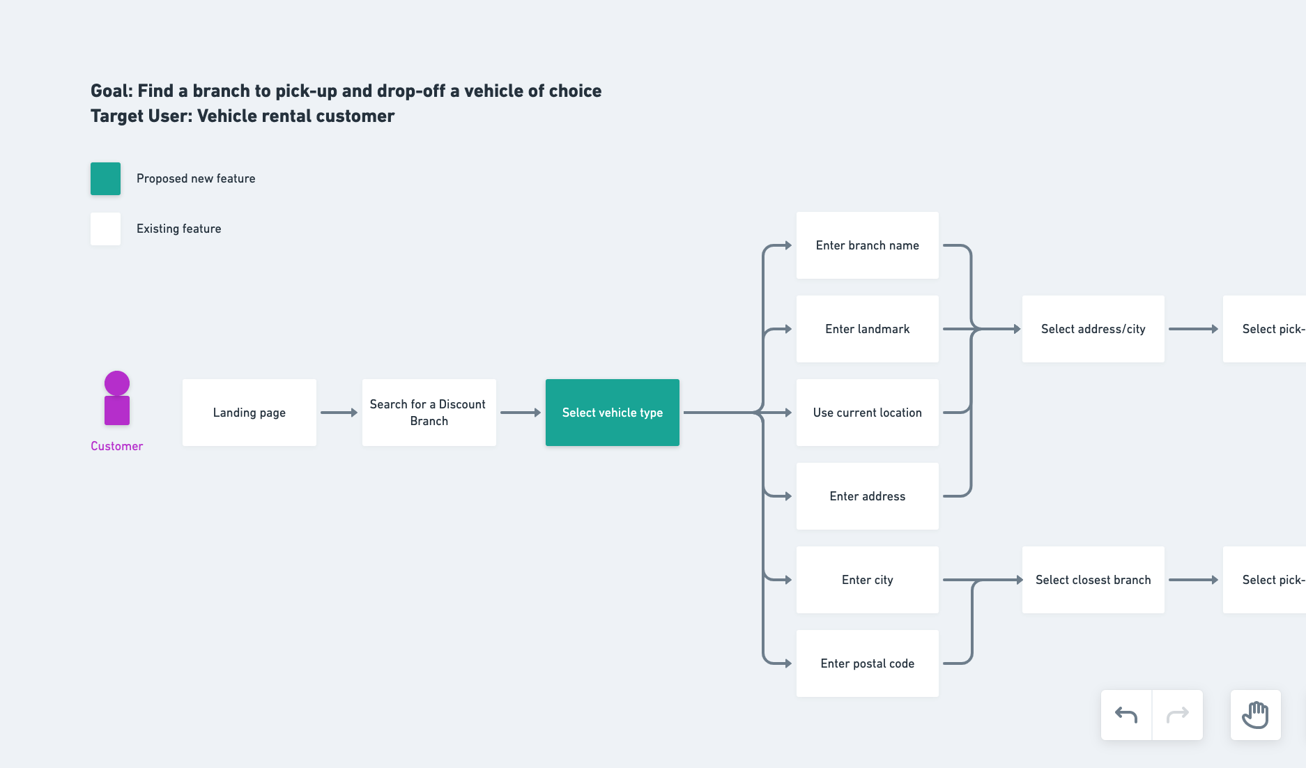
A flow diagram was created to map out new features that would address the top pain points mentioned above. By outlining the steps, I used the diagram to discuss the feasibility of certain features with their developers. It was necessary to be able to collaborate to get an understanding of what types of information could be displayed from their API. The user flow would then be used to inform the ideation phase to design key screens.
Wireframes For Top 3 U-turns
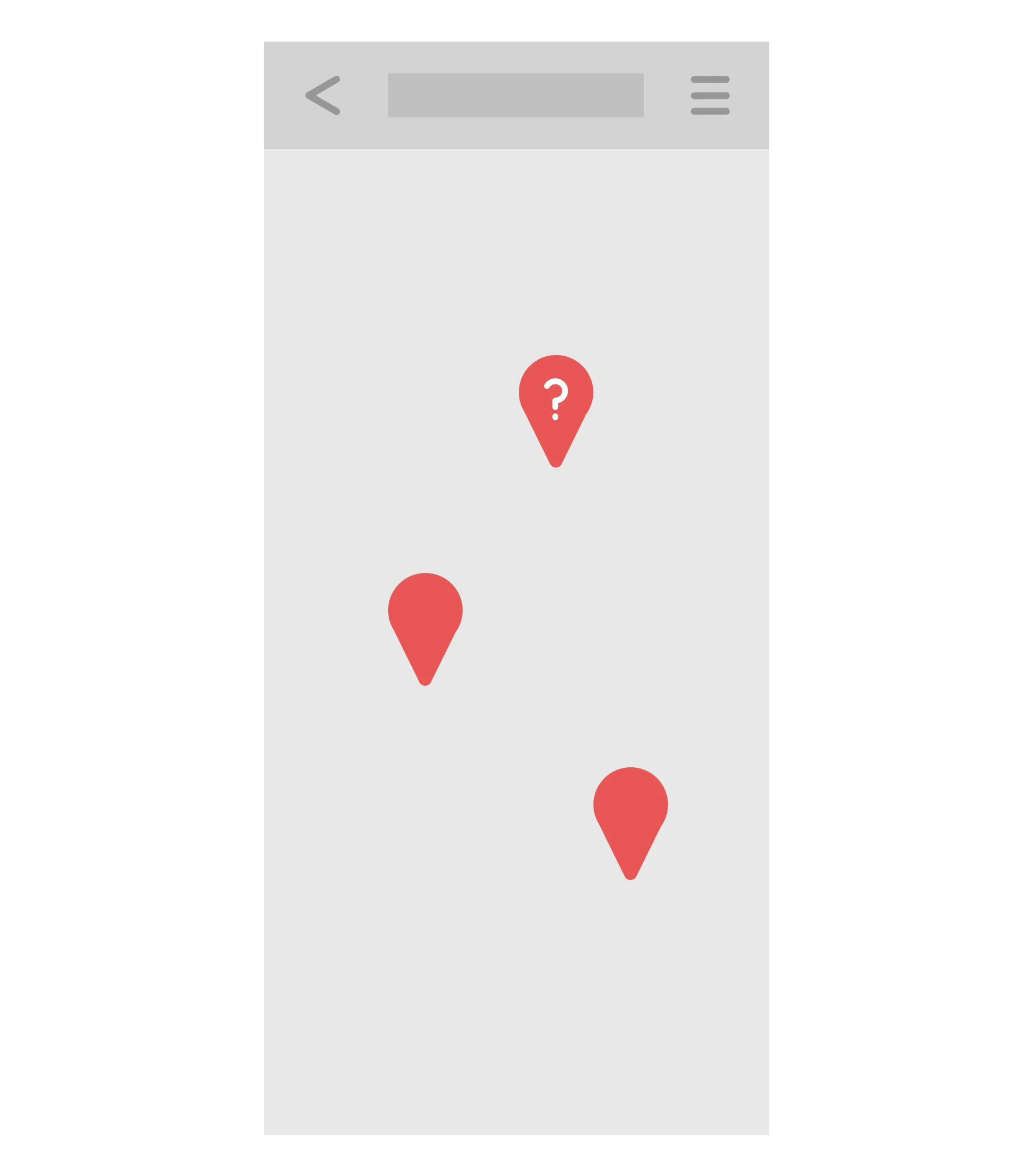
Due to time constraints on the project, we prioritized the redesign of specific screens based on the areas that caused the most u-turns in the reservation funnel. The goal of the redesign was to allow users to always move forward and provide them with the next best options when faced with a roadblock. This provides users a sense of forward momentum rather than feeling like there are dead ends in the journey. By addressing those issues, we can alleviate the cognitive load on the user to remember options available to them and hopefully minimize user fallout.
Top 3 areas of focus for UX improvements:
Show upfront information to make quicker and better informed decisions
Make recommendations when a branch is closed
Make recommendations when no vehicles are available
Outcomes
Usability test reports for their mobile and desktop experience to inform points of friction to stakeholders
Initial UX recommendations to be used as a focal point for the next working engagement
A product strategy report that will help drive a workshop with stakeholders to rank prioritization of work for 2020
Next Steps
The research and initial ideas around areas of opportunities to redesign were meant to inform the next phase of work with Discount Car and Truck Rentals. From a design strategy perspective, my next area of focus would be to map out the entire booking funnel flow to document all business rules, edge cases, scenarios, and the unhappy path before wireframing the entire experience. During the next phase, I would be working with a visual designer to begin discussing a new visual design language for the brand. I would also be taking a look at the entire site holistically to include SEO optimizations to drive organic search traffic to their website as part of their larger product strategy.
Learnings
Lead with data when possible
A lot of time was spent at the beginning of the project deciding what the right research methodology should be used to consult a digital strategy for the client. It was helpful to work with the web analyst to set up analytics on their website to observe the conversion funnel and set up benchmarks for testing in the future. It helped immensely for creating our first hypothesis to drive our first usability test.
Allow ample amount of time to usability test
It was important to spend time crafting the test protocol and review it with team members and stakeholders to ensure that we were testing with the correct scenarios and tasks to collect useful feedback. Because I only had 2 weeks to conduct usability tests, I needed time to work on the logistics of scheduling participants to come into the office and recruit assistants to run the sessions. If it weren’t for the colleagues I recruited, it would have been impossible for me to complete usability tests in the time I was given.


